
2025
NOCAP
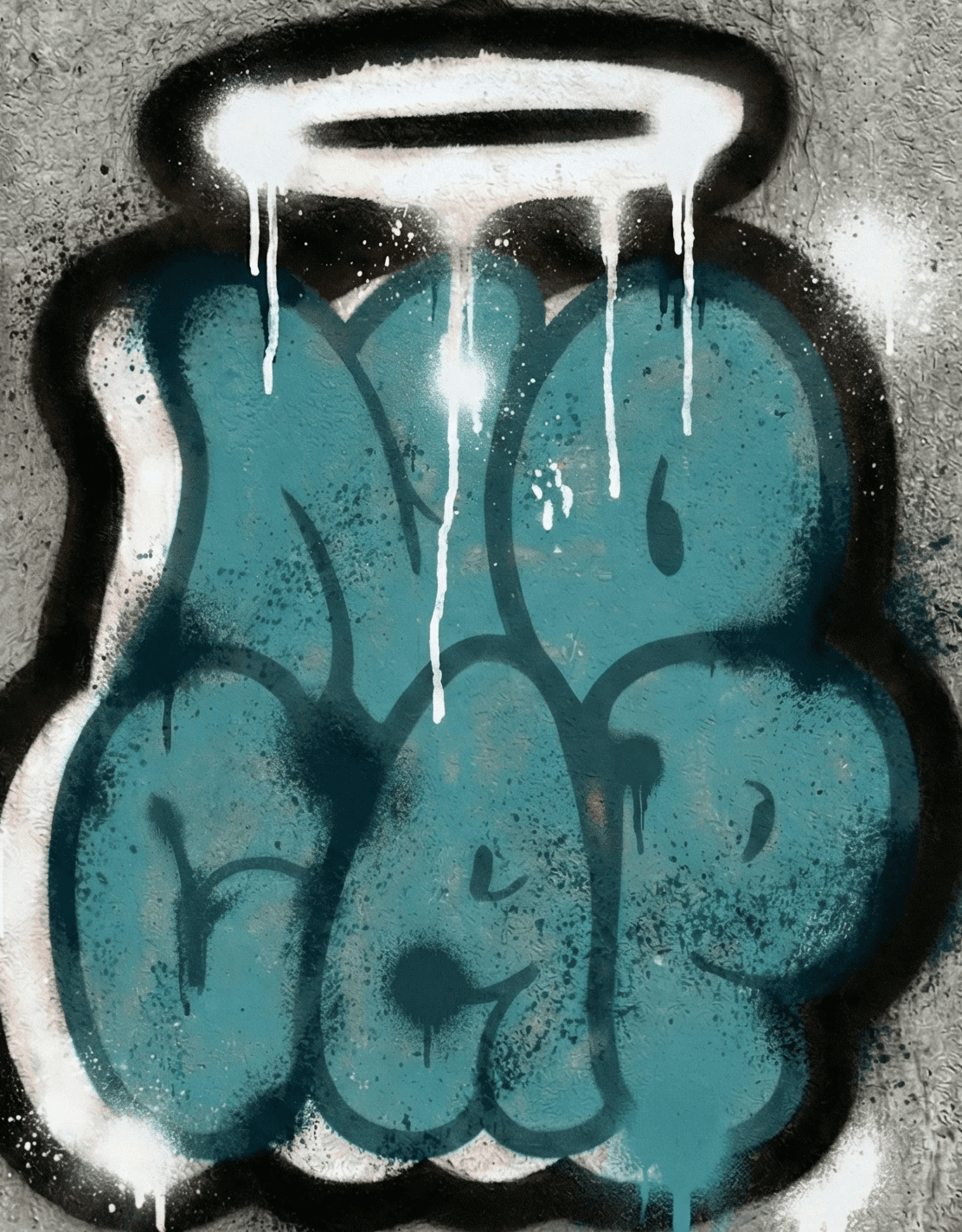
A branding and visual identity project for No Cap Chocolate focused on creating a bold youthful and flavour driven brand with strong shelf presence.
Branding
Packaging
Advertizing
A branding and visual identity project for No Cap Chocolate focused on creating a bold youthful and flavour driven brand with strong shelf presence.
About Nocap
No Cap is a chocolate bar brand built around honesty fun and unexpected flavour experiences. It targets a young modern audience looking for bold taste combinations presented through a confident and expressive brand identity.

Design Approach
My approach was to design a playful expressive identity supported by a structured packaging system that clearly differentiates flavours while maintaining strong brand consistency
The project began with market and competitor analysis to understand category clutter and consumer behaviour in the chocolate segment. I studied shelf patterns colour usage and visual language of existing brands to identify opportunities for differentiation.
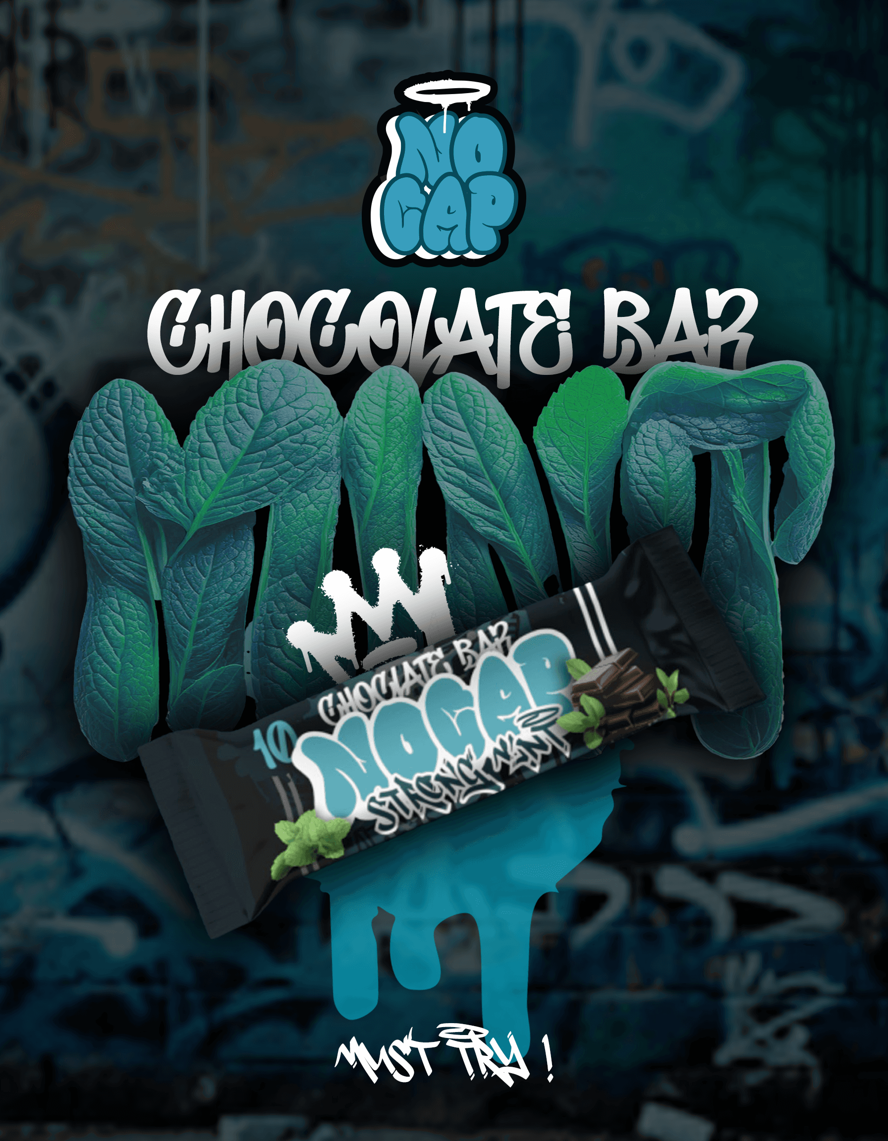
Strong Mint used cool deep greens with sharp graphic accents to communicate freshness and intensity.
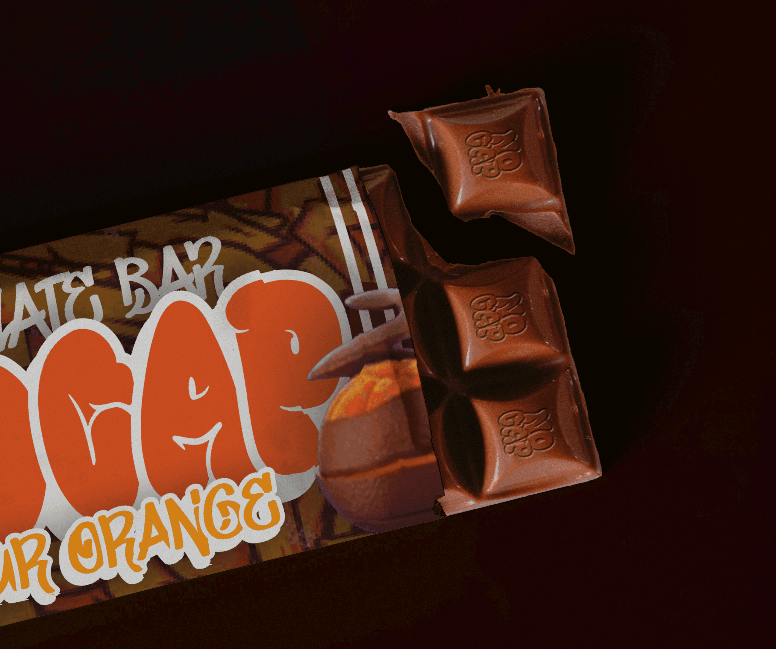
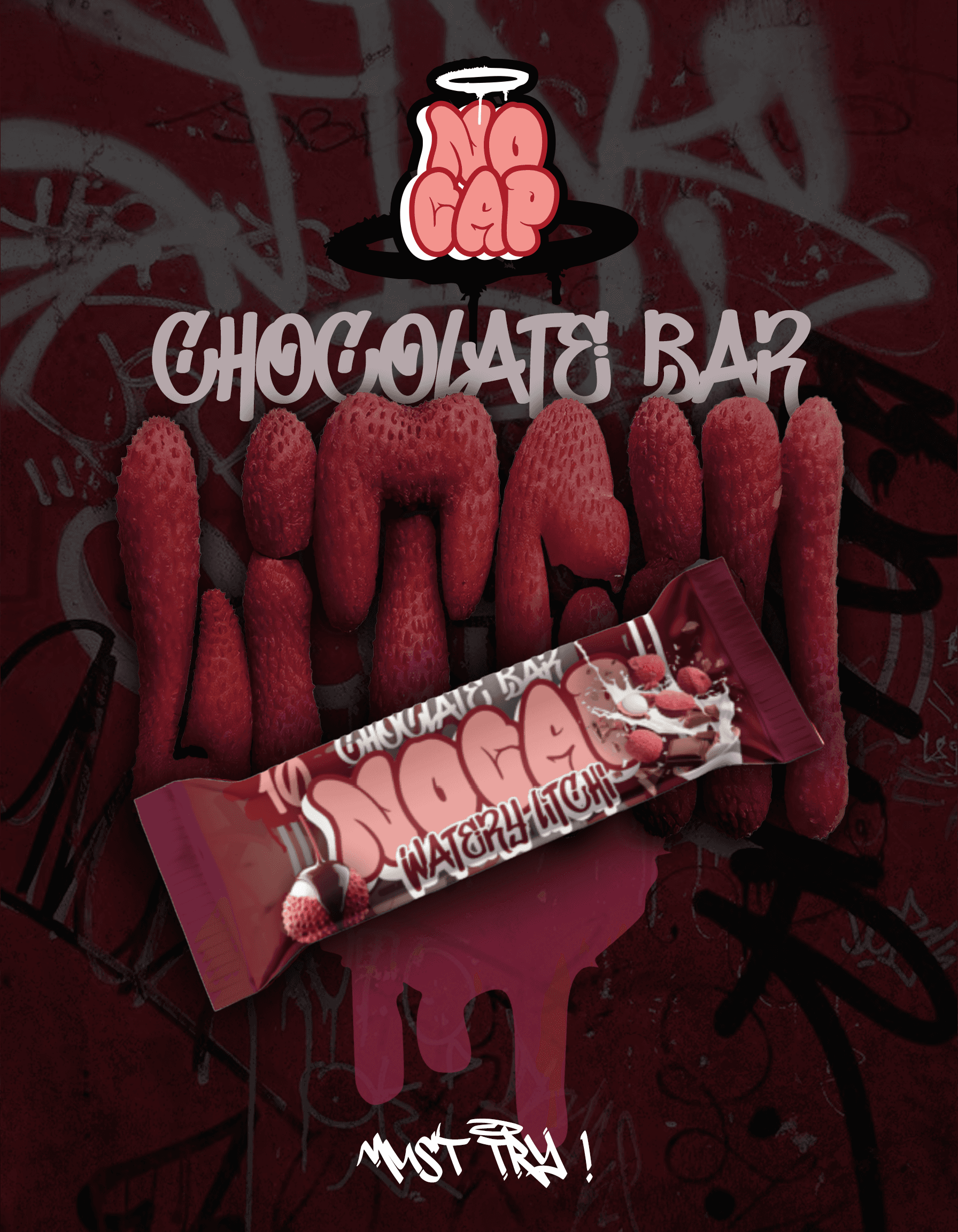
Sour Orange was represented through vibrant citrus tones and energetic visual elements to express tanginess and punch. Watery Litchi used soft pinks and translucent tones to convey lightness freshness and a juicy sensory feel.
This system was designed to scale easily for future flavours without compromising brand recognition.



Solution
The solution was a bold branding and packaging system with clear flavour wise differentiation. A fixed structure combined with expressive colour palettes ensured high shelf impact while keeping the brand cohesive and recognisable.

Result
A distinctive chocolate brand with strong shelf visibility and easy flavour recognition.
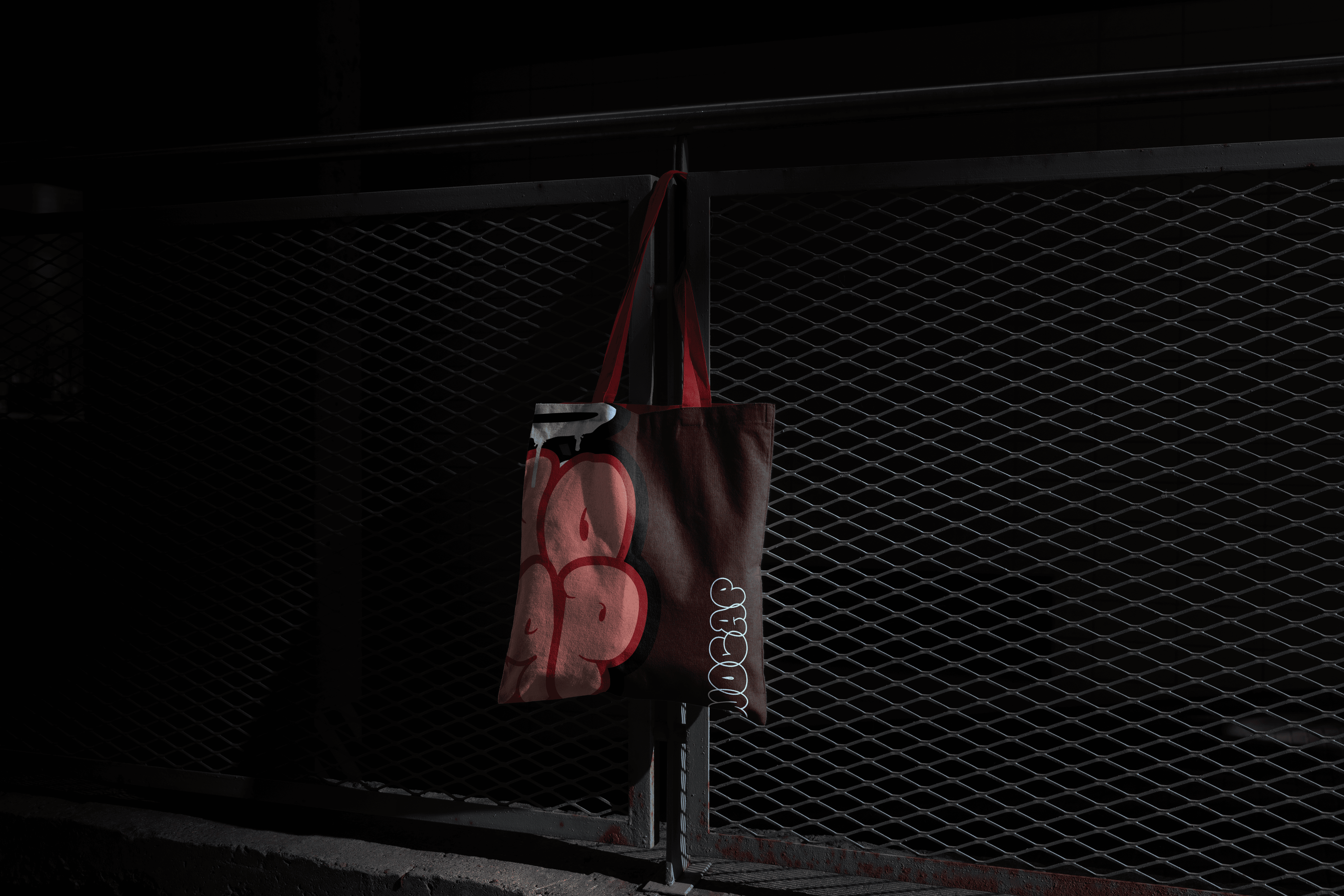
The final outcome positioned No Cap as a fun confident and modern chocolate brand. Flavour specific colour coding and visual hierarchy improved consumer engagement and made product selection effortless at point of sale. The packaging system supports future expansion while maintaining a consistent and memorable brand identity.

More Works
(GQ® — 02)
©2024
FAQ
01
What does a project look like?
02
How is the pricing structure?
03
Are all projects fixed scope?
04
What is the ROI?
05
How do we measure success?
06
What do I need to get started?


2025
NOCAP
A branding and visual identity project for No Cap Chocolate focused on creating a bold youthful and flavour driven brand with strong shelf presence.
Branding
Packaging
Advertizing
A branding and visual identity project for No Cap Chocolate focused on creating a bold youthful and flavour driven brand with strong shelf presence.
About Nocap
No Cap is a chocolate bar brand built around honesty fun and unexpected flavour experiences. It targets a young modern audience looking for bold taste combinations presented through a confident and expressive brand identity.

Design Approach
My approach was to design a playful expressive identity supported by a structured packaging system that clearly differentiates flavours while maintaining strong brand consistency
The project began with market and competitor analysis to understand category clutter and consumer behaviour in the chocolate segment. I studied shelf patterns colour usage and visual language of existing brands to identify opportunities for differentiation.
Strong Mint used cool deep greens with sharp graphic accents to communicate freshness and intensity.
Sour Orange was represented through vibrant citrus tones and energetic visual elements to express tanginess and punch. Watery Litchi used soft pinks and translucent tones to convey lightness freshness and a juicy sensory feel.
This system was designed to scale easily for future flavours without compromising brand recognition.


Solution
The solution was a bold branding and packaging system with clear flavour wise differentiation. A fixed structure combined with expressive colour palettes ensured high shelf impact while keeping the brand cohesive and recognisable.


Result
A distinctive chocolate brand with strong shelf visibility and easy flavour recognition.
The final outcome positioned No Cap as a fun confident and modern chocolate brand. Flavour specific colour coding and visual hierarchy improved consumer engagement and made product selection effortless at point of sale. The packaging system supports future expansion while maintaining a consistent and memorable brand identity.


More Works
(GQ® — 02)
©2024
FAQ
01
What does a project look like?
02
How is the pricing structure?
03
Are all projects fixed scope?
04
What is the ROI?
05
How do we measure success?
06
What do I need to get started?


2025
NOCAP
A branding and visual identity project for No Cap Chocolate focused on creating a bold youthful and flavour driven brand with strong shelf presence.
Branding
Packaging
Advertizing
A branding and visual identity project for No Cap Chocolate focused on creating a bold youthful and flavour driven brand with strong shelf presence.
About Nocap
No Cap is a chocolate bar brand built around honesty fun and unexpected flavour experiences. It targets a young modern audience looking for bold taste combinations presented through a confident and expressive brand identity.

Design Approach
My approach was to design a playful expressive identity supported by a structured packaging system that clearly differentiates flavours while maintaining strong brand consistency
The project began with market and competitor analysis to understand category clutter and consumer behaviour in the chocolate segment. I studied shelf patterns colour usage and visual language of existing brands to identify opportunities for differentiation.
Strong Mint used cool deep greens with sharp graphic accents to communicate freshness and intensity.
Sour Orange was represented through vibrant citrus tones and energetic visual elements to express tanginess and punch. Watery Litchi used soft pinks and translucent tones to convey lightness freshness and a juicy sensory feel.
This system was designed to scale easily for future flavours without compromising brand recognition.


Solution
The solution was a bold branding and packaging system with clear flavour wise differentiation. A fixed structure combined with expressive colour palettes ensured high shelf impact while keeping the brand cohesive and recognisable.


Result
A distinctive chocolate brand with strong shelf visibility and easy flavour recognition.
The final outcome positioned No Cap as a fun confident and modern chocolate brand. Flavour specific colour coding and visual hierarchy improved consumer engagement and made product selection effortless at point of sale. The packaging system supports future expansion while maintaining a consistent and memorable brand identity.


More Works
©2024
FAQ
What does a project look like?
How is the pricing structure?
Are all projects fixed scope?
What is the ROI?
How do we measure success?
What do I need to get started?
